Create Your First Project
Start adding your projects to your portfolio. Click on "Manage Projects" to get started
Orka
Project type
Brand Design - Print
Date
2024
Role
Design Specialist
Business Folder
Orka Systems print folders exemplify a sophisticated approach to corporate branding. Leveraging a minimalist aesthetic, the design employs a stark black backdrop to accentuate the vibrant, almost electric blue circular motif. This visual language evokes a sense of energy and innovation, key attributes of the tech industry. The strategic use of varied finishes and subtle embossing techniques elevates the tactile experience, adding a premium feel. This project demonstrates a keen understanding of how to translate brand identity across different mediums, creating a cohesive and impactful offline experience that complements the company’s digital presence.
Business Brochure
Orka Systems trifold brochure expertly balances form and function. Its impactful design utilizes a minimalist aesthetic, bold imagery, and a considered color palette to reinforce the brand’s technological prowess. The layout expertly guides the reader through concise content, ensuring key information is easily absorbed. This piece exemplifies how effective print design can be a powerful tool for communicating brand identity and key messaging.
Group logo design
Logo designs for ORKA company presents a versatile and adaptable identity system. The minimalist approach utilizes a unique arrangement of geometric shapes and typography to create a distinctive mark. The „O“ with a central dot evokes a target or focus, possibly hinting at precision and accuracy. The sharp angles of the „R“, „K“ and „A“ add a dynamic element, suggesting forward movement and progress.
The design demonstrates flexibility through variations in color and background gradients, allowing the logo to adapt to different sub-brands and applications while maintaining a cohesive visual language. This approach creates a strong and memorable brand identity that can be easily recognized and applied across various mediums.
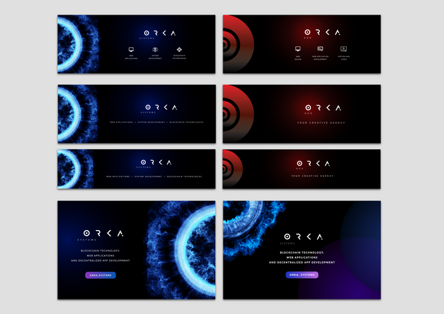
Social media images
„ORKA’s“ social media imagery effectively utilizes a cohesive visual language with consistent logo usage, color palette, and abstract visuals to establish a recognizable brand identity. Dynamic particle effects, bold colors, and minimalist layouts ensure engaging content that remains informative and adapts to various platforms and audiences. This strong visual consistency strengthens brand recognition and reinforces ORKA’s technological focus.


